After visiting a number of airports around the region, I have come to realise a number of similarities in their design.
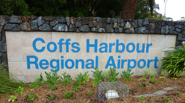
A) Grand Entrance & Big Signboard:
You need a big sign of the airport name on the front of the terminal building. With this in place, even a blur/drunk person will be able to identify that he is at the correct airport when he hops off a cab.


B) Smaller signboards
Some of the airport buildings may be so small and lack the building structure to erect a big signboard like in (A). Therefore, they usually have smaller signboards placed near the entrance. It serves the same purpose

C) Design of control tower.
All airports need a control tower for the air traffic controllers to monitor the air traffic. A control tower is therefore needed nearby.

Tower at Coffs Harbour Airport

Tower at Sunshine Coast Airport

Tower at Rockhampton Airport
Realize that their designs are rather similar - cuboid structure with an octagonal head at the top. I guess this design is probably the cheapest and most ergonomic design template.. thats why almost every airport build their tower this way.
D) Curved porch for pick-ups and drop-offs
Good design for drivers. From one end, you can see right to the other end of the porch and look for a spot to park your car.


E) Restaurants and facilities in the terminal
As these airports do not have the heavy traffic volume of big international airports, their terminal buildings are usually quite small. The departure and arrival halls can be merely 20 meters away from each other. It somewhat looks like a bus terminal inside.

There is a food court in Sunshine Coast airport as compared to just a coffee stand with 5 tables in Tamworth Airport.

End-to-end of Tamworth Airport terminal building is barely over 100 meters long. Within it there is the departure counter, gates, cafe, car rental booths, toilets, arrival hall, luggage belt, etc etc, all packed next to each other.

F) Airport Logo
Apart from the big signboards mentioned in (A) and (B), these airports also have their individual logos to "brand" themselves.


A quick glance reveals that the designers like to use bright and primary colours such as blue, yellow and green. Thick and bold brushstrokes create simple designs to feature the local specialty. For eg, Gold Coast is famous for Surfer's Paradise, thus the design of waves. Tamworth is a mountainous area thus the design of humps. Sunshine Coast for its beach and Mackay for its mining industry.
G) Lack of Aerobridge
As the traffic is low and mostly domestic travellers, there is no need to spend money on aerobridges on the apron side.

Gold Coast Airport - airside
I hope this fun blog entry gives everyone a rough idea of what to expect when transiting through a domestic airport on the east coast.
This also marks the end of my close-to 2 year stay in Australia. It is indeed a nice place and I will come back again in the future for a real holiday. Take care & G'Day!
Kenny, this blog needs updating :) Tell us about the many places you've been to!
ReplyDeleteshared info is very helpful, Aluminium Scaffolding Manufacturer...
ReplyDelete